
Red/Cyan 3D glasses are needed to view the photos in this post. Also, the whole post is kind of pointless without them. Well, more pointless than usual. That’s saying a lot.
Yeah, yeah, I know. Just last month, I promised two posts a month, and this month I did three instead. I ain’t great with promises, but there’s a reason; just this once, I’m going to pull back the curtains and give a peek behind the scenes. The last two posts talking about the MyHeritage algorithms were originally one post discussing all three photo-enhancement tools, but I couldn’t find a way to fit the facial enhancing tool into the ‘narrative’ without making it too drawn out, so eventually ended up cutting it into a smaller second post. That’s why, despite the sole purpose of my blog being to show my multispectral and/or 3D photos, my entire second post was centred around two photos that were not taken by me, not multispectral, and not 3D.
… and while we’re behind the scenes, lets stay there for this post, because I’m pretty sure I messed up the drawstrings somehow and those curtains are heavy. I’ll try to sort it out, but in the meantime, I thought I’d write about why I show a lot of 3D photos in black and white.
I mostly post my 3D photos as anaglyphs(ie. the type of pictures where red/cyan 3D glasses are needed).

Why? Well, it seemed to be the best compromise between a bunch of different problems I had to navagate. The glasses are cheap and easy to find, and with them, the viewer doesn’t require any skills to see the 3D(such as the ‘cross your eyes’ trick). It’s also fairly easy to create anaglyphs and to post the resulting 3D images online as jpegs. The file size can be small, and the 3D effect works just as well at different scales; not knowing how the blog post will display on different devices really reduces my options. The choice of anaglyphs to display images isn’t perfect… after all, not many blogs require viewers to have extra tools on hand to enjoy them… but it balances enough different factors for me to use them. Maybe sometime I’ll write about other ways I could have done 3D, but first I’d have to come up with a bunch of bad jokes to go with it.
However, as it is a balancing issue. There are some drawbacks to these kind of anaglyphs, and one of the biggest drawbacks with using them is the colour. When I post my photos, sometimes they are in colour, and sometimes in greyscale. The original two images are always in colour when I take them, so why do I remove the colour information? To put it in brief, it is possible to get colour images when viewing them in 3D anaglyphs, but it’s not always a good idea. The problem comes with the glasses themselves, and the way they are used for 3D.
To see a three-dimensional image, each eye needs to see a different photo; they’re photos of the same subject, but taken at a slightly different angle. To separate the two versions of the photo, the red lens ‘hides’ some parts of the photo; it makes the red aspects of the image appear white and cyan dark. The cyan hides does the opposite, making red dark and cyan white. As digital displays consist of a red, green, and blue lights to show colours, it matches up well to them.
… cyan is a greenish/blueish colour. Sorry. I should have mentioned that earlier, I guess.
Anyways, if you keep the colour in the original images, it often looks okay. it looks like you’re just looking at a real subject through red/cyan glasses, honestly, and your brain can ‘edit’ the lenses out to give you an idea of the colour. Most times. The one big issue is if the photo has colours that are similar to the colours of the lenses. If something is too red or too cyan, things get weird; the colour looks black in one eye and red in the other.
Time to put your 3D glasses on.

SEE? SEE??
Ignore that text; that’s just some subliminal messaging techniques I’m testing completely random examples of text I was using for no purpose. Instead, just look at the colours. It is strange to see them through the glasses. It appears to be almost greyscale, but shimmery; which side is white and which side is black? It all depends on which eye you use. Look at it again with the glasses; this time, close an eye. Now the other eye. Now, a couple questions. what side is light, and what side is dark? Also, do you have any feelings on your preferred font types?
This is kind of fun to do with images above, but I find it can be really distracting with any real photos. This is why I try not to buy clothes that are red or cyan; If I for some reason try to take a photo of myself in 3D, I’d rather not worry about the colours clashing. I also have to keep an eye out for other examples of these forbidden colours that might be around… red cars, flowers, and most notably, my great enemy, a clear day. Depending on the lighting, the open sky can approach that ‘too cyan’ colour and mess up my 3D photo, which is why I am on record as supporting air pollution. A grey smoggy sky is much more conductive to three dimensional photography.
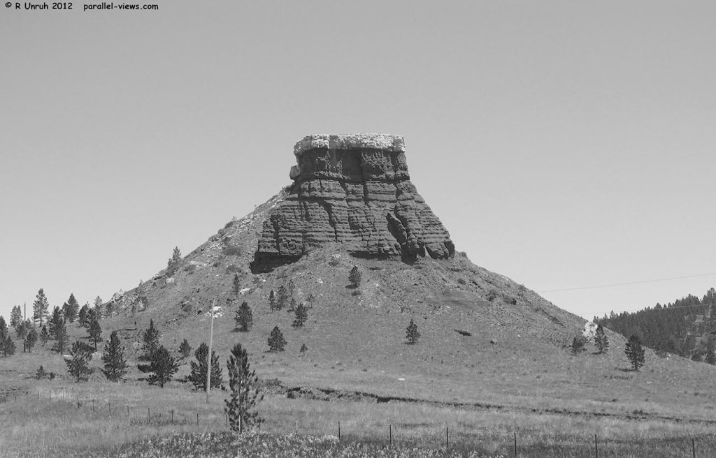
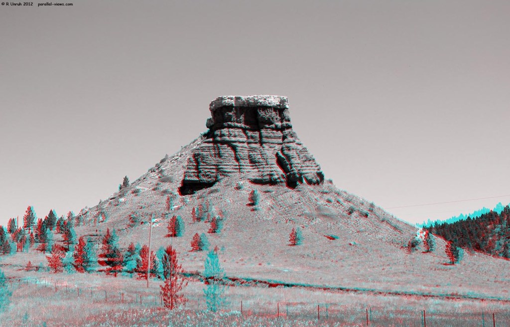
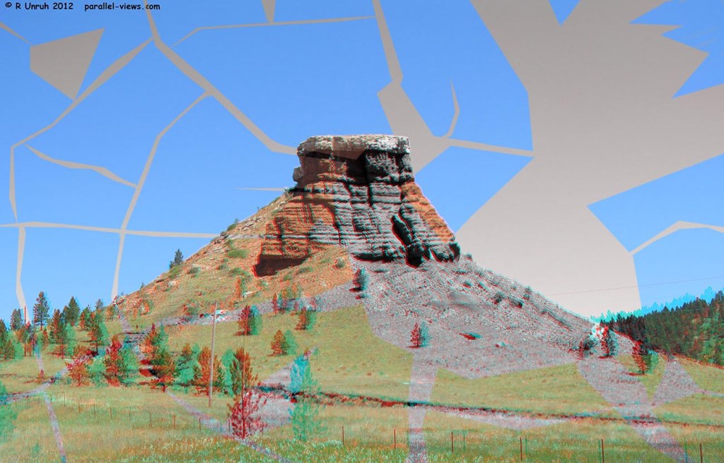
Take this 3D photo. Maybe some nice tasteful pollution could have saved it.

This is a large butte just west of the USA’s Black Hills. It’s along highway 585, Wyoming. It might be called Red Rock, but the only reason I know this is because of a postcard of it from 1999(and thank you photographer Mike Johnson for literally the most information I’ve ever found about the outcrop). This is one of the photos I’ve considered using for a few blog posts, but I really don’t have enough to write about it to make it worthwhile. Instead, I dumped it backstage behind the curtains with the other things I don’t want but can’t bear to throw out.
To me, this photo doesn’t work as 3D. The butte is too reddish, and the sky too cyanish(my spellchack says that isn’t a word, but if ‘greenish’ and ‘bluish’ are words, so is ‘cyanish’. My spellchack also says it should be called spellcheck, but if it’s wrong about cyanish, what else is it wrung about?). If the two colours weren’t placed right against one another, it might still work in the photo, but as it is, it is almost impossible to focus on the edges of the butte. They’re bright against a dark sky in one eye, and dark against a bright sky in the other.
I don’t know if it is just me, or if other people find that clash distracting. It might be something more subjective, or some universal weird brain thingie(the technical term) that has something to do with the ‘illusion’ of colour filtered through coloured lenses. Maybe you’re fine with it. I don’t really know, and its distracting to me, so I feel like I can say I don’t like this picture. Lets break down why. Literally.
Now, if I was going to talk about this in multiple spectra, I’d break this photo down into the red, blue, and green channels. I’m not going to do that, so lets just break the photo down to the red and blue/green channels instead.

The lighter the colour, the more red it is; the butte is very light, the sky darker, and the trees very dark. Therefore, there is a lot of red light in the butte, less in the sky, and almost none in the trees.
If I look at the Blue/Green components of the photo, however:
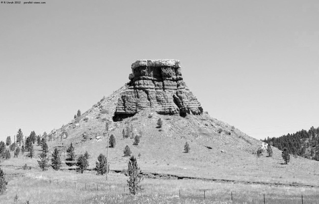
Now the sky is light, the butte is dark, and the trees… are still dark, so lets ignore them for now. Most notable, there is a lot more blue and green light in the cap of the butte than in the lower sections; that’s why the top, when viewed in full colour, doesn’t look red. Instead, it is a very light tan, almost grey; to get a better idea of the true colour, here’s a non 3D, boring old two dimensional colour photo of it.

Looking solely at the red channel, it would be easy to miss the cap; all the rock and soil reflects a similar amount of red light. If you look at the red and cyan left and right images side by side, it looks like this:

Completely different.
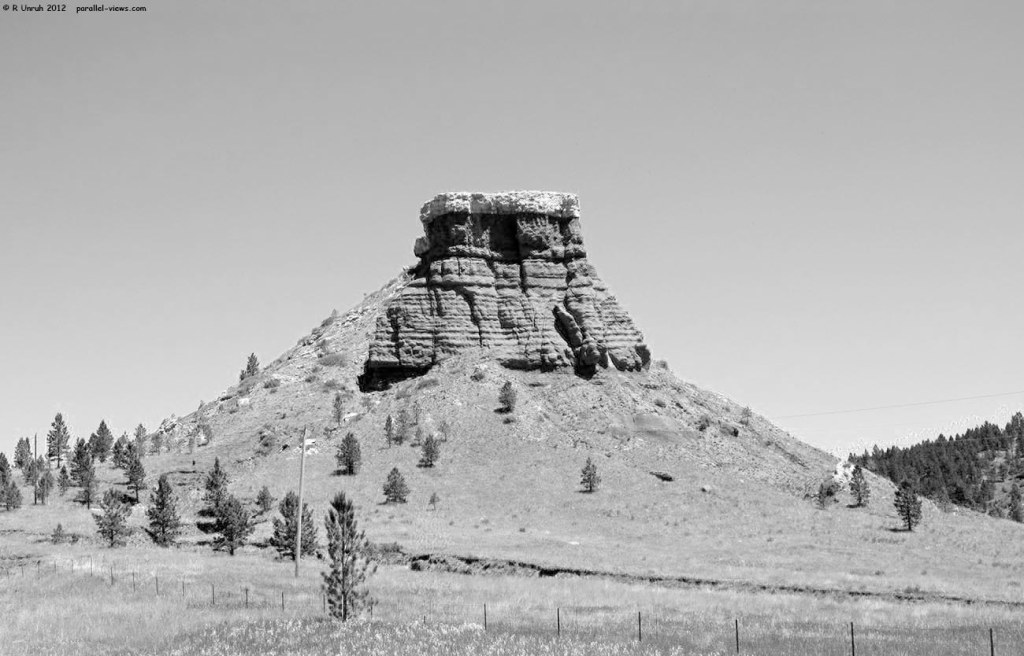
I chose this image for another reason. For a period, I only saved my photos in anaglyph format; I printed out sterescope views, but didn’t save them, and I hadn’t learned about formats such as MPO or JPS format. After looking at the original 3D image, I decided it would be better to do it in black and white, and put it on my to-do list. Unfortunately, my computer had its own to-do list, and top of its list was ‘die’.
Okay, no problem; I back up all my raw photos. After getting a new computer and setting up my preferred software, I plugged in the external hard drive and…
… nothing. The hard drive didn’t even start spinning. Apparently my computer had copied its to-do list from the external drive. The sub-par colour image was the best I had(the physical copies just didn’t have a good enough resolution once scanned). I was frustrated. It’s so close to being a good 3D photo; you can make out the details and everything. However,If I split the colours, they look different; the desaturating has to occur before the left and right photos are merged. Because the photos were taken at different angles, It isn’t just a matter of recombining the channels; that just ends up with a copy of the 3D photo above:

Maybe some kind of AI algorithm could make two ‘normal’ colour photos with this, but I can’t do it. I have no idea how I would find an algorithm for this task, and besides, me and algorithms have a… complicated relationship.
However, I ingeniously devised a solution in the fall using cutting-edge technology. The solution was ‘discover an even older hard drive I forgot about’. I unexpectedly had the original images again, and now could finally get rid of that pesky colour, then combine the greyscale images into this:
Now, with the new decoloured version, if I separate the red and cyan, I get…
and…
Which is which? They look the same. That’s the point. There isn’t any weird colour contrast issues. If you put them side by side again, the only difference is the position of the objects in the view, as they were taken at different angles. Side by side again, they’re almost identical, and the differences in shade are mostly due to the cameras using slightly different settings.

After rambling on about it much too long, there’s the real answer. That’s the reason why I sometimes post colour photos, and sometimes black and white. Now you saw a bit of my creative process. It’s time to once again close the curtain, and go back to WATCH OUT THE CURTAINROD IS–
$&@%!
… I knew there was a reason no one is allowed behind the scenes. It really isn’t safe for the public back here. Insurance is gonna kill me; I just broke Wyoming, and that’s not cheap to replace. I can’t pay that deductible. Is that even covered under my plan?
Look…lets pretend nothing happened. You weren’t here. Just tell everyone that Wyoming really looks like that in real life. Maybe show them the image below as proof.
…Could you ask them what fonts they like best while you’re at it?
The above photos were taken with a Canon Powershot SX130 IS Camera
